Form
When we have the need to make custom forms, we will make use of a custom class that integrates the Validate library.
This allows us to set up many options of validation for form fields, and to control when that validation happens.
Here we’ll cover three cases:
- Validation on blur
Happens when the user clicks outside of the field after having focused it.
- Validation on submit / on click
Happens when the user clicks on the submit button.
- Advanced example with checkboxes, radios and select elements
The validation happens on submit, but you can see some other elements being used aside from regular text inputs
This time we’ll tackle HTML and JS for each case separately, so it’s easier to see all together.
We do have a custom class, you can refer to it in the Punky base repository at src/js/handler/form/Form.js, since it’s a complex class that you won’t need to modify. It is also available in the documentation of the validate library that we mentioned above.
There is just one handler that deals with all the examples shown below, but it’s better to store the configurations in their own separate folder / files to avoid making a huge handler file.
As always, you have your constructor with your configurations, only this time they come from an external file.
  constructor(payload) {    super(payload);
    // Coming from external    this.config = ({element}) => configFormBlur({Manager:this.Manager, element});    this.configClick = ({element}) => configFormClick({element});    this.configClickAdvanced = ({element}) => configFormAdvanced({element});
    this.init();    this.events();  }
DOM and init method are the same as in every handler.
  get updateTheDOM() {    return {      formValidate: document.querySelectorAll(`.js--form-validate-blur`),      formValidateClick: document.querySelectorAll('.js--form-validate-click'),      formValidateAdvanced: document.querySelectorAll('.js--form-validate-advanced')    };  }
  init() {    super.getLibraryName("Form");  }
And events too, using our basic SWUP hooks through our custom events.
  events() {    this.emitter.on("MitterContentReplaced", async () => {      this.DOM = this.updateTheDOM; // Re-query elements each time this is called
      super.assignInstances({        elementGroups: [          {            elements: this.DOM.formValidate,            config: this.config,            boostify: { distance: 30 },          },           {            elements: this.DOM.formValidateClick,            config: this.configClick,            boostify: { distance: 30 },          },          {            elements: this.DOM.formValidateAdvanced,            config: this.configClickAdvanced,            boostify: { distance: 30 },          },        ]      });    });
    this.emitter.on("MitterWillReplaceContent", () => {      if (this.DOM.formValidate.length) {        super.destroyInstances();      }      if (this.DOM.formValidateClick.length) {        super.destroyInstances();      }      if (this.DOM.formValidateAdvanced.length) {        super.destroyInstances();      }    });  }
Validation on blur
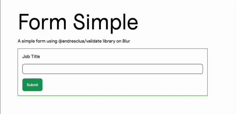
Section titled “Validation on blur”We have our basic form, inside a form element, which is the one that will have the js-- class that instantiates our Form class.
Inside, the input will contain an ID that will help us target it when we need to validate it through our configuration.
<div class="f--container"> <div class="f--row"> <div class="f--col-6"> <form class="c--form-a js--form-validate-blur"> <div class="c--form-group-a"> <label class="c--label-a" for="job_title">Job Title</label> <div class="c--form-input-a"> <input class="c--form-input-a__item" type="text" id="job_title" /> </div> </div> <button type="button" class="c--btn-a">Submit</button> </form> </div> </div> </div>Our configuration will need to contain the element itself, and the fields that we want to validate.
As stated above, we will catch them using their ID, and then we can assign them a validation function. In this case, we will perform string validations, we’ll make it required and get a minimum length of 2.
Here we can also state the messages that we want to show in case the validation is not passing.
export const configFormBlur = (payload) => { var { Manager, element} = payload; var gsap = Manager.libraries.GSAP.gsap; return { element, fields: [ { element: element.querySelector("#job_title"), validationFunction: "isString", config: { required: true, minLength: 2, customMessage: { required: "Job Title can't be empty.", minLength: "Job Title must be at least 2 characters long.", }, }, on: 'blur', }, ], onComplete: () => { ... } };};Aside from that basic configuration, we can also use our onComplete callback to perform actions once the validation has finished running.
In this case, we have a spinner that appears and disappears, leveraging the GSAP animation library we use throughout the project.
export const configFormBlur = (payload) => {    var { Manager, element} = payload;    var gsap = Manager.libraries.GSAP.gsap;    return {        element,        fields: [            ...        ],        onComplete: () => {            const spinner = element.querySelector(".c--loader-a");            if (!spinner) return;
            const tl = gsap.timeline();
            tl.set(spinner, { display: "block" }) // in case it was hidden            .fromTo(                spinner,                { opacity: 0 },                { opacity: 1, duration: 0.3, ease: "power2.out" } // quick fade-in            )            .to(                spinner,                { opacity: 1, duration: 0.8 } // leave it there a bit (feels natural)            )            .to(                spinner,                {                opacity: 0,                duration: 0.4,                ease: "power2.inOut",                onComplete: () => {                    spinner.style.display = "none";                },                }            );        }    };};
Validation on submit
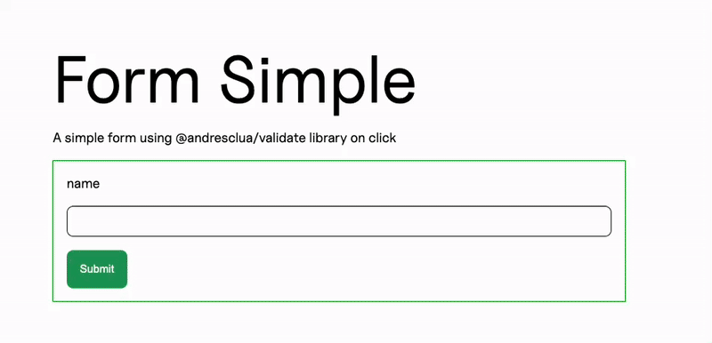
Section titled “Validation on submit”Our HTML is very similar, we just need to make sure our submit button is able to be captured by our JS by adding another js-- class to it.
<div class="f--container"> <div class="f--row"> <div class="f--col-6"> <form class="c--form-a js--form-validate-click"> <div class="c--form-group-a"> <label class="c--label-a" for="name">name</label> <div class="c--form-input-a"> <input class="c--form-input-a__item" type="text" id="name" /> </div> </div> <button type="button" class="submit c--btn-a js--form-validate-click-submit">Submit</button> </form> </div> </div> </div>Configuration is simple and very similar to the one above, where we can choose our validation function, add a required condition, a minimum length and custom messages for each validation that does not pass.
The only difference is that here we need to add our submit button into the configuration, so the library knows when it needs to activate.
export const configFormClick = ({element}) => ({ element, submitButtonSelector: ".js--form-validate-click-submit", fields: [ { element: element.querySelector("#name"), validationFunction: "isString", config: { required: true, minLength: 5, customMessage: { required: "Name can't be empty.", minLength: "Name must be at least 5 characters long.", }, }, on: null, }, ], onSubmit: () => { ... },});We can add behaviour in our onSubmit callback, too.
Advanced example
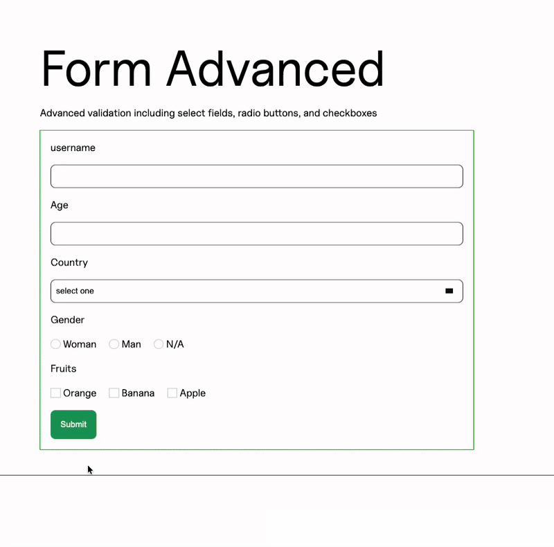
Section titled “Advanced example”Here we can see three other options for our validations:
- A select input, that will need to have only a valid ID so we can capture it in our validator JS code
- A series of three radio inputs, that will need:
- An ID on the container div for all of them, in this case
radioForm - A class on each of the items, in this case
c--form-radio-a__item
- An ID on the container div for all of them, in this case
- A series of checkboxes, with the same setup as the radio options
And since our validation will be happening on submit, we also have our submit button with our js-- class.
    <div class="f--container">      <div class="f--row">        <div class="f--col-6">            <form class="c--form-a js--form-validate-advanced">                <!-- regular text inputs -->
                 <div class="c--form-group-a">                    <label class="c--label-a" for="country">Country</label>                    <div class="c--form-select-a">                        <select id="country" class="c--form-select-a__item">                            <option value="" disabled="" selected="">select one</option>                            <option value="spain">Spain</option>                            <option value="USA">USA</option>                            <option value="Uruguay">Uruguay</option>                        </select>
                    </div>                </div>
                <div class="c--form-group-a" id="radioForm">                    <label class="c--label-a" for="country">Gender</label>                    <div class="c--form-radio-a">                        <input type="radio" id="option-1" name="choice" class="c--form-radio-a__item">                        <label class="c--form-radio-a__title" for="option-1">Woman</label>                    </div>                    <div class="c--form-radio-a">                        <input type="radio" id="option-2" name="choice" class="c--form-radio-a__item">                        <label class="c--form-radio-a__title" for="option-2">Man</label>                    </div>                    <div class="c--form-radio-a">                        <input type="radio" id="option-3" name="choice" class="c--form-radio-a__item">                        <label class="c--form-radio-a__title" for="option-3">N/A</label>                    </div>                </div>
                <div class="c--form-group-a" id="checkbox" >                    <label class="c--label-a" for="country">Fruits</label>                    <div class="c--form-checkbox-a">                        <input type="checkbox" id="item-1" class="c--form-checkbox-a__item interaction-group">                        <label class="c--form-checkbox-a__title" for="item-1">Orange</label>                    </div>                    <div class="c--form-checkbox-a">                        <input type="checkbox" id="item-2" class="c--form-checkbox-a__item interaction-group">                        <label class="c--form-checkbox-a__title" for="item-2">Banana</label>                    </div>                    <div class="c--form-checkbox-a">                        <input type="checkbox" id="item-3" class="c--form-checkbox-a__item interaction-group">                        <label class="c--form-checkbox-a__title" for="item-3">Apple</label>                    </div>                </div>
<button type="button" class="c--btn-a js--form-validate-advanced-submit">Submit</button> </form> </div> </div> </div>Our configuration will need to include all fields that we want to validate. We’ve omitted the text inputs here since they’re covered in the previous configurations.
Here you can see:
- The select input uses the
isSelectvalidation function and is required. - The radios use both the outer ID and the classes of each item and the
isRadiovalidation function, with a custom message. - The checkboxes have a similar setup to the radios, but they use the
isCheckboxvalidation function, which allows us to send a minimum number of options selected to validate.
export const configFormAdvanced = ({element}) => ({    element,     submitButtonSelector: element.querySelector(".js--form-validate-advanced-submit"),    fields: [        ...        {            element: element.querySelector("#country"),            validationFunction: "isSelect",            config: {                required: true,            },            on: null,        },        {            elements: document.querySelectorAll("#radioForm .c--form-radio-a__item"),            validationFunction: "isRadio",            config: {                required: true,                customMessage: {                    required: "Select a Gender",                },            },            on: null,        },        {            elements: document.querySelectorAll("#checkbox .c--form-checkbox-a__item"),            validationFunction: "isCheckbox",            config: {                minRequired: 2,                customMessage: {                    minRequired: "At least two options must be selected."                },            },            on: null,        },
    ]});
Knowledge Check
Test your understanding of this section
Loading questions...