Slider
Simple example
Section titled “Simple example”Our first example is very simple, it’s just a slider with six numbers in it. We have no custom attributes in our HTML, no custom behavior defined.
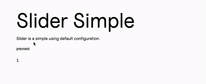
<div class="f--container"> <div class="f--row"> <div class="f--col-12"> <div class="c--slider-a js--slider"> <div>1</div> <div>2</div> <div>3</div> <div>4</div> <div>5</div> <div>6</div> </div> </div> </div></div>Example with a definite number of slides showing
Section titled “Example with a definite number of slides showing”This one is still very simple, but it has a small tweak: we can set with an attribute how many slides we want to show at once. Here we are using our data-slider-items property for that, and we’ll pick it up in our JS.
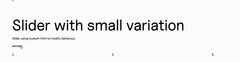
<div class="f--container"> <div class="f--row"> <div class="f--col-12"> <div class="c--slider-a js--slider" data-slider-items="3"> <div>1</div> <div>2</div> <div>3</div> <div>4</div> <div>5</div> <div>6</div> </div> </div> </div></div>First bigger variation: custom controls
Section titled “First bigger variation: custom controls”This one also uses our data-slider-items to define the amount of slides on screen, but it adds custom controls to the element.
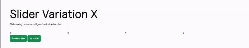
<div class="f--container"> <div class="f--row"> <div class="f--col-12"> <div class="c--slider-a"> <div class="js--slider-x" data-slider-items="4"> <div>1</div> <div>2</div> <div>3</div> <div>4</div> <div>5</div> <div>6</div> </div> <button class="c--slider-a__btn js--slider-x-prev c--btn-a">Previous Slide </button> <button class="c--slider-a__btn js--slider-x-next c--btn-a">Next slide</button> </div> </div> </div></div>Second variation: custom controls and autoplay
Section titled “Second variation: custom controls and autoplay”This one looks exactly the same in our HTML, but our JS will have the autoplay additional option associated to this js--slider-y
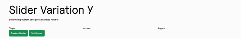
<div class="f--container"> <div class="f--row"> <div class="f--col-12"> <div class="c--slider-a"> <div class="js--slider-y" data-slider-items="2"> <div>Mara</div> <div>Gotzon</div> <div>Nerea</div> <div>Eli</div> <div>Felipe</div> <div>Amaia</div> <div>Diego</div> <div>Andres</div> <div>Angela</div> <div>Mauro</div> </div> <button class="c--slider-a__btn js--slider-y-prev c--btn-a">Previous Member</button> <button class="c--slider-a__btn js--slider-y-next c--btn-a">Next Member</button> </div> </div> </div></div>This handler will contain all the different configurations for our sliders.
We do have some common ground, though, so we can use a common configuration that we can later call in each of our variations:
this.commonConfig = ({ element }) => ({ onInit: () => { var gsap = this.Manager.getLibrary("GSAP").gsap; gsap.set(this.DOM.element, { display: "flex" }); gsap.to(this.DOM.element, { opacity: 1, duration: 0.5, ease: "power4.in", delay: 0.25 }); }, // Items can come from an attribute or be fixed at 2 items: parseInt(element.getAttribute("data-slider-items")) || 2,});So our regular config would be just:
this.config = ({ element }) => { return { Manager: this.Manager, sliderConfig: this.commonConfig({ element }), };};And this would work for our first two examples, since we have our items attribute in our common config and it’s the only difference between them.
But our first variation would be a bit more elaborated, with custom controls:
this.configVariationX = ({ element }) => { return { Manager: this.Manager, sliderConfig: { // we spread the object returned by our common config to add it to our custom config ...this.commonConfig({ element }), // We add custom controls to our slider controls: true, nextButton: document.querySelector(".js--slider-x-next"), prevButton: document.querySelector(".js--slider-x-prev"), }, };};And lastly, for our second variation, we can add our autoplay too:
this.configVariationY = ({ element }) => ({ Manager: this.Manager, sliderConfig: { ...this.commonConfig({ element }), controls: true, autoplay: true, autoplayButtonOutput: false, nextButton: document.querySelector(".js--slider-y-next"), prevButton: document.querySelector(".js--slider-y-prev"), responsive: { 1024: { items: 3, }, }, },});Our DOM would contain all three variations to associate each configuration to its corresponding element:
get updateTheDOM() { return { sliderElement: document.querySelectorAll(".js--slider"), sliderElementVariationX: document.querySelectorAll(".js--slider-x"), sliderElementVariationY: document.querySelectorAll(".js--slider-y"), };}And then we can instantiate all of our elements in our MitterContentReplaced as usual:
this.emitter.on("MitterContentReplaced", async () => { this.DOM = this.updateTheDOM; super.assignInstances({ elementGroups: [ { elements: this.DOM.sliderElement, config: this.config, }, { elements: this.DOM.sliderElementVariationX, config: this.configVariationX, }, { elements: this.DOM.sliderElementVariationY, config: this.configVariationY, boostify: { distance: 50 }, }, ], });});And if we use our Slider inside another class, we can instantiate only the element that we’re interested in at our Slider:load event:
this.emitter.on("Slider:load", (payload) => { this.DOM = this.updateTheDOM; super.assignInstances({ elementGroups: [ { elements: this.DOM.sliderElement, config: this.config, boostify: { distance: 30 }, }, ], forceLoad: true, });});Custom class
Section titled “Custom class”In the case of the Slider, we do use an external library (tiny slider) but we control how we send our information using a custom class that we include in our slider folder, next to our handler.
This class contains a constructor where we receive our configuration and our Manager, and we will use the Manager to access our GSAP and hide our Slider until it’s mounted in our init() method:
    constructor(payload){        var { el,Manager,sliderConfig} = payload;        this.DOM = {            element: el,        }        this.config = sliderConfig;        this.Manager = Manager;
        this.init();    }
    init(){        var gsap = this.Manager.getLibrary("GSAP").gsap;        gsap.set(this.DOM.element, {  opacity: 0});
        this.slider = tns({            container: this.DOM.element,            ...this.config,        });
        gsap.set(this.DOM.element, {  opacity: 100});    }
By using a custom class we can also access our slider instance and use tiny slider’s exposed methods play and pause:
    play() {      this.slider.play();    }
    pause() {        this.slider.pause();    }
And of course we need a destroy method too:
destroy() { if (this.slider) { this.slider.destroy(); this.slider = null; } }Knowledge Check
Test your understanding of this section
Loading questions...