Performance
Web performance is a key pillar at Terra. We continuously monitor, measure, and improve performance to ensure fast, accessible, and reliable user experiences across all projects.
What is web performance?
Section titled “What is web performance?”Web performance refers to how fast and efficiently a website loads, renders, and responds to user interactions.
It directly impacts:
- User experience
- Accessibility
- SEO rankings
- Conversion rates
At Terra, performance is not a one-time task, but an ongoing process of measurement and improvement.
How do we check web performance?
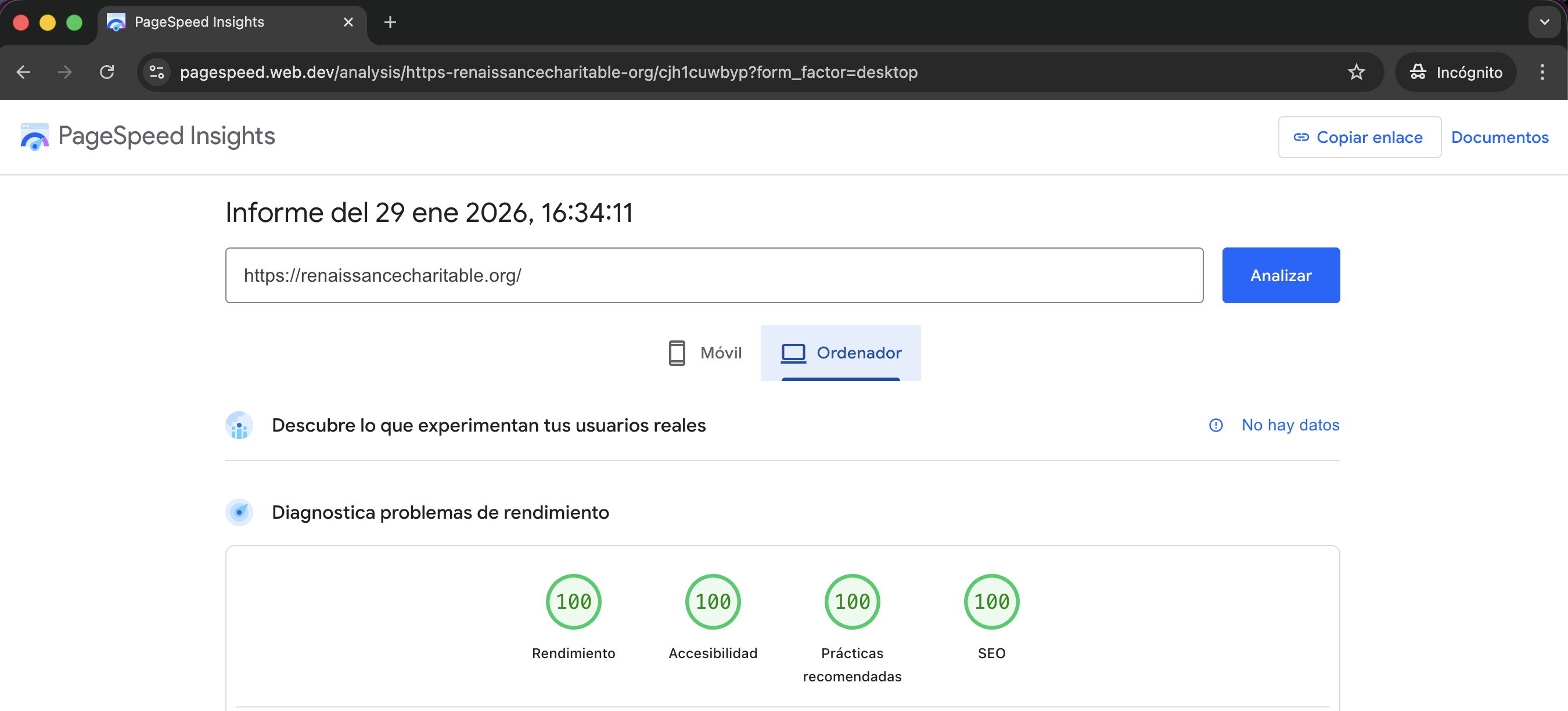
Section titled “How do we check web performance?”We mainly rely on Google PageSpeed Insights to evaluate web performance.
Key metrics we monitor include:
- Performance score
- Accessibility
- Best Practices
- SEO
Our goal is to achieve high and stable scores, above 85.
How do we register web performance before launching?
Section titled “How do we register web performance before launching?”Before launching a project, we always register baseline performance metrics in a ClickUp card. How we do it:
- We run Google PageSpeed Insights on the core pages of the website, both on desktop and mobile.
- Follow the performance recommendations described in this article
- Fill the Results table attached in the CU card (example bellow):
| Core Page | Desktop – Initial | Desktop – After Performance | Mobile – Initial | Mobile – After Performance |
|---|---|---|---|---|
| Page 1 | Performance: SEO: Accessibility: Best Practices: Screenshot: link | Performance: SEO: Accessibility: Best Practices: Screenshot: link | Performance: SEO: Accessibility: Best Practices: Screenshot: link | Performance: SEO: Accessibility: Best Practices: Screenshot: link |
| Page 2 | Performance: SEO: Accessibility: Best Practices: Screenshot: link | Performance: SEO: Accessibility: Best Practices: Screenshot: link | Performance: SEO: Accessibility: Best Practices: Screenshot: link | Performance: SEO: Accessibility: Best Practices: Screenshot: link |
Best practices to ensure good performance
Section titled “Best practices to ensure good performance”- Use Boostify to optimize and manage JavaScript loading
- Use Swup to improve navigation performance and perceived speed
- Mobile-first approach. In new projects, we work with a mobile-first strategy. Stylesheets are loaded once and progressively enhanced through breakpoints. Desktop devices load additional rules, while mobile devices only load what they need, making this approach more efficient.
- Font optimization with fallbacks
Knowledge Check
Test your understanding of this section
Loading questions...