Split CSS by breakpoints
To add to our performance objectives and complement our mobile-first approach, we split our SCSS by breakpoints so only the necessary SCSS loads in each one of them.
This means that our mobile version will only load the styles it needs for mobile, which would be the base stylesheet. After that, each breakpoint would load one more stylesheet with the media queries pertaining to that breakpoint and all the ones below it, so desktop (or wide if present) would load all files.
Steps to split a project’s SCSS - WordPress version
Section titled “Steps to split a project’s SCSS - WordPress version”Installations
Section titled “Installations”You will need to install the following packages if not already present:
npm i postcss-scss postcss-safe-parser
1. Create your splitting utility
Section titled “1. Create your splitting utility”Create a JavaScript file inside the config folder. The template is as follows:
// Used in: node split-by-breakpoints.js input.css dist/import fs from "fs";import path from "path";import postcss from "postcss";import safeParser from "postcss-safe-parser";
const [, , outDir = "dist"] = process.argv;
// search the file in the dist folderconst distFiles = fs.readdirSync("dist");const cssFile = distFiles.find((file) => file.startsWith("ProjectStyles.") && file.endsWith(".css"));
if (!cssFile) {    console.error("File not found in dist folder");    process.exit(1);}
const inputPath = path.join("dist", cssFile);
const css = fs.readFileSync(inputPath, "utf8");const root = postcss.parse(css, { parser: safeParser });
// the breakpoints we wantconst BP = {    desktop: 1700,    laptop: 1570,    tabletl: 1300,    tabletm: 1024,    tablets: 810,    mobile: 580,};
// pre-create roots even though they might be emptyconst groups = {    base: postcss.root(),    desktop: postcss.root(),    laptop: postcss.root(),    tabletl: postcss.root(),    tabletm: postcss.root(),    tablets: postcss.root(),    mobile: postcss.root(),};
const normalize = (s = "") => s.toLowerCase().replace(/\s+/g, " ").trim();
// detects in a @media coincides with a max-widthconst matchMaxWidth = (params, px) => {    const p = normalize(params);    return p.includes(`(max-width: ${px}px)`);};
// assigns @media to the correct group if it matches an exact breakpoint// returns true if processed, false if it does not coincide with any breakpointsconst routeAtRule = (atrule) => {    const params = normalize(atrule.params || "");
    if (matchMaxWidth(params, BP.desktop)) {        groups.desktop.append(atrule.clone());        return true;    }    if (matchMaxWidth(params, BP.laptop)) {        groups.laptop.append(atrule.clone());        return true;    }    if (matchMaxWidth(params, BP.tabletl)) {        groups.tabletl.append(atrule.clone());        return true;    }    if (matchMaxWidth(params, BP.tabletm)) {        groups.tabletm.append(atrule.clone());        return true;    }    if (matchMaxWidth(params, BP.tablets)) {        groups.tablets.append(atrule.clone());        return true;    }    if (matchMaxWidth(params, BP.mobile)) {        groups.mobile.append(atrule.clone());        return true;    }
    // No coincide con ningún breakpoint    return false;};
// go over the rootroot.nodes.forEach((node) => {    if (node.type === "atrule" && node.name === "media") {        // media that doesn't match a breakpoint → base        if (!routeAtRule(node)) {            groups.base.append(node.clone());        }    } else {        groups.base.append(node.clone());    }});
// exitfs.mkdirSync(outDir, { recursive: true });
// write filesconst hash = path.basename(inputPath, ".css").split(".")[1];
function write(name, ast) {    const outPath = path.join(outDir, `${name}.${hash}.css`);    fs.writeFileSync(outPath, ast.toResult().css, "utf8");    console.log("↳ created:", path.relative(process.cwd(), outPath));}
Object.entries(groups).forEach(([name, ast]) => write(name, ast));
console.log(":white_check_mark: Split OK at:", path.relative(process.cwd(), outDir));
console.log(`OK → ${path.resolve(outDir)}`);
We would modify only these two objects to add / remove breakpoints or change their sizings.
// the breakpoints we wantconst BP = {    desktop: 1700,    laptop: 1570,    tabletl: 1300,    tabletm: 1024,    tablets: 810,    mobile: 580,};
// pre-create roots even though they might be emptyconst groups = { base: postcss.root(), desktop: postcss.root(), laptop: postcss.root(), tabletl: postcss.root(), tabletm: postcss.root(), tablets: postcss.root(), mobile: postcss.root(),};2. Create an activator
Section titled “2. Create an activator”Create a script in package.json that will execute your file and add it to your build script:
{ "name": "wp-vite-starter-2024", "version": "1.0.0", "description": "vite starter", "main": "index.js", "scripts": { "virtual": "cross-env NODE_ENV=virtual vite", "local": "NODE_ENV=local vite build", "build": "NODE_ENV=production vite build && npm run split", "split": "node config/split-css.mjs" }, ...}These will execute the file and effectively split your SCSS in your build.
3. Add your new SCSS files to your enqueues
Section titled “3. Add your new SCSS files to your enqueues”Now, instead of enqueuing only one styling file, you’ll need to include all the new css files that are going to be created in your build:
add_action( 'wp_enqueue_scripts', function() {
    if (defined('IS_VITE_DEVELOPMENT') && IS_VITE_DEVELOPMENT === true) {        ...    } else {        ...
        wp_enqueue_style('project-build-base',  get_template_directory_uri() . '/dist/base.'.hash.'.css' );        wp_enqueue_style('project-build-desktop', get_template_directory_uri() . '/dist/desktop.'.hash.'.css', [], null, '(max-width: 1700px)');        wp_enqueue_style('project-build-laptop',  get_template_directory_uri() . '/dist/laptop.'.hash.'.css',  [], null, '(max-width: 1570px)');        wp_enqueue_style('project-build-tabletl', get_template_directory_uri() . '/dist/tabletl.'.hash.'.css', [], null, '(max-width: 1300px)');        wp_enqueue_style('project-build-tabletm', get_template_directory_uri() . '/dist/tabletm.'.hash.'.css', [], null, '(max-width: 1024px)');        wp_enqueue_style('project-build-tablets', get_template_directory_uri() . '/dist/tablets.'.hash.'.css', [], null, '(max-width: 810px)');        wp_enqueue_style('project-build-mobile',  get_template_directory_uri() . '/dist/mobile.'.hash.'.css', [], null, '(max-width: 580px)');
}});Steps to split a project’s SCSS - Astro version
Section titled “Steps to split a project’s SCSS - Astro version”Installations
Section titled “Installations”You will need to install the following packages if not already present:
npm i postcss-scss postcss-safe-parser
1. Add the SplitByBreakpoints utility
Section titled “1. Add the SplitByBreakpoints utility”We need to create a folder at the root called optimization and create a file there called index.js. This would be the template of that file:
import fs from "fs";import path from "path";import { fileURLToPath } from "node:url";import postcss from "postcss";import safeParser from "postcss-safe-parser";
export function splitByBreakpoints() {    // Mobile-first breakpoints using min-width    const BP = {        tablets: 580,        tabletm: 810,        tabletl: 1024,        laptop: 1300,        desktop: 1570,        wide: 1700,    };
    const CSS_NAME = /^style\.[^/\\]+\.css$/i;
    function findStyleCss(startDir) {        const matches = [];        const stack = [startDir];        while (stack.length) {            const current = stack.pop();            const entries = fs.readdirSync(current, { withFileTypes: true });            for (const e of entries) {                const full = path.join(current, e.name);                if (e.isDirectory()) stack.push(full);                else if (CSS_NAME.test(e.name)) matches.push(full);            }        }        const astro = matches.find((p) => p.split(path.sep).includes("_astro"));        return astro || (matches.length ? matches[0] : null);    }
    // Mobile-first: match exact (min-width: NNNpx)    const EXACT_BP_RE = /^\s*(?:only\s+)?(?:screen|all)?(?:\s+and\s+)?\(\s*min-width\s*:\s*(\d+)\s*px\s*\)\s*$/i;
    function getExactMinWidth(params) {        const match = params.match(EXACT_BP_RE);        if (match) return parseInt(match[1], 10);        return null;    }
    return {        name: "post-build-split-by-breakpoints",        hooks: {            "astro:build:done": async ({ dir }) => {                const distPath = fileURLToPath(dir);                const target = findStyleCss(distPath);
                if (!target) {                    console.error(":x: No se encontró style.{hash}.css en dist.");                    return;                }
                const targetDir = path.dirname(target);                const fileName = path.basename(target);                const match = fileName.match(/^style\.([^.]+)\.css$/);                const hash = match ? match[1] : "nohash";
                const css = fs.readFileSync(target, "utf8");                const root = postcss.parse(css, { parser: safeParser });
                // Mobile-first: base contains mobile styles (no media query)                const groups = {                    base: postcss.root(),                    tablets: postcss.root(),                    tabletm: postcss.root(),                    tabletl: postcss.root(),                    laptop: postcss.root(),                    desktop: postcss.root(),                    wide: postcss.root(),                };
                function routeNode(node) {                    if (node.type === "atrule" && node.name === "media") {                        const mw = getExactMinWidth(node.params || "");                        const entry = Object.entries(BP).find(([_, val]) => val === mw);                        if (entry) {                            const [key] = entry;                            groups[key].append(node.clone());                            return;                        }                        // media that doesn't match a breakpoint → base                        groups.base.append(node.clone());                        return;                    }
                    // any other node that's not @media → base (mobile styles)                    groups.base.append(node.clone());                }
                root.nodes.forEach(routeNode);
                function write(name, ast) {                    const outPath = path.join(targetDir, `${name}.${hash}.css`);                    fs.writeFileSync(outPath, ast.toResult().css, "utf8");                }
                Object.entries(groups).forEach(([name, ast]) => write(name, ast));            },        },    };}
And the editable parts would be:
const BP = { tablets: 580, tabletm: 810, tabletl: 1024, laptop: 1300, desktop: 1570, wide: 1700,};const groups = { base: postcss.root(), tablets: postcss.root(), tabletm: postcss.root(), tabletl: postcss.root(), laptop: postcss.root(), desktop: postcss.root(), wide: postcss.root(),};We would need to edit those in case we wanted to change the widths of the breakpoints or add / remove one of them.
2. Add this utility to your astro.config.js
Section titled “2. Add this utility to your astro.config.js”export default defineConfig({ ... integrations: [splitByBreakpoints()],});3. Create a Styles.astro component
Section titled “3. Create a Styles.astro component”This component will hold all the CSS routes to add to our head.
---import stylesUrl from "@styles/style.scss?url";
let splitCss = null;if (import.meta.env.PROD) { const m = stylesUrl.match(/style\.([^.]+)\.css$/); const hash = m ? m[1] : null; const baseDir = stylesUrl.replace(/style\.[^.]+\.css$/, ""); if (hash) { // Mobile-first: base contains mobile styles, others are progressively larger splitCss = { base: `${baseDir}base.${hash}.css`, tablets: `${baseDir}tablets.${hash}.css`, tabletm: `${baseDir}tabletm.${hash}.css`, tabletl: `${baseDir}tabletl.${hash}.css`, laptop: `${baseDir}laptop.${hash}.css`, desktop: `${baseDir}desktop.${hash}.css`, wide: `${baseDir}wide.${hash}.css`, }; }}---
{!import.meta.env.PROD && <link id="andres" rel="stylesheet" href={stylesUrl} />}
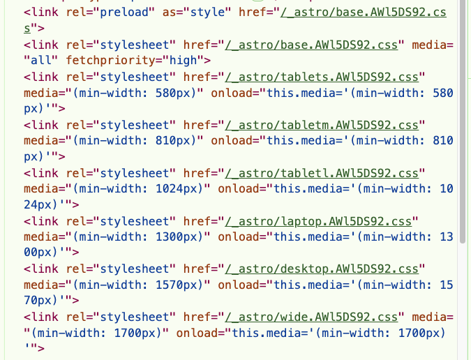
{import.meta.env.PROD && splitCss && ( <> {/* Base (mobile): blocking + high priority */} <link rel="preload" as="style" href={splitCss.base} /> <link rel="stylesheet" href={splitCss.base} media="all" fetchpriority="high" />
{/* Mobile-first: progressively load larger breakpoints using min-width */} <link rel="stylesheet" href={splitCss.tablets} media="print" onload="this.media='(min-width: 580px)'" /> <link rel="stylesheet" href={splitCss.tabletm} media="print" onload="this.media='(min-width: 810px)'" /> <link rel="stylesheet" href={splitCss.tabletl} media="print" onload="this.media='(min-width: 1024px)'" /> <link rel="stylesheet" href={splitCss.laptop} media="print" onload="this.media='(min-width: 1300px)'" />
<link rel="stylesheet" href={splitCss.desktop} media="print" onload="this.media='(min-width: 1570px)'" />
<link rel="stylesheet" href={splitCss.wide} media="print" onload="this.media='(min-width: 1700px)'" />
<noscript> <link rel="stylesheet" href={splitCss.tablets} media="(min-width: 580px)" /> <link rel="stylesheet" href={splitCss.tabletm} media="(min-width: 810px)" /> <link rel="stylesheet" href={splitCss.tabletl} media="(min-width: 1024px)" /> <link rel="stylesheet" href={splitCss.laptop} media="(min-width: 1300px)" /> <link rel="stylesheet" href={splitCss.desktop} media="(min-width: 1570px)" /> <link rel="stylesheet" href={splitCss.wide} media="(min-width: 1700px)" /> </noscript> </>)}We would need to edit this file to also match our breakpoints with those in vars.
Each breakpoint needs two link: one outside and another one inside the noscript tag.
We add the preload tag to our base scss, since it’s the biggest of all of them.
4. Import this component in Layout.astro
Section titled “4. Import this component in Layout.astro”Finally, we’ll import the component inside our head in our Layout:
<html lang={language} dir="ltr"> <head> <Fragment set:html={mergedSeo.headerScripts} /> <meta charset="UTF-8" /> <meta name="viewport" content="width=device-width" /> <Seo payload={mergedSeo} /> ... <Styles /> </head> <body>...</body></html>How to check it’s working
Section titled “How to check it’s working”When you make a build or upload to your server, you should see all your css files instead of just one:
Knowledge Check
Test your understanding of this section
Loading questions...